
Our Solar System--Overview
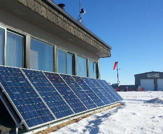
We installed a grid-tie solar system on our office in the fall of 2012. The array consisted of nine 250 watt panels, each with its own micro-inverter. Then, in January of 2016, we added nine more panels, just south of the first nine. The second set of panels have a slightly higher output, but in round figures, we are generating 4 kilowatts of power on sunny days. The output is greater in the summer than the winter, partially due to higher sun angle, but mostly due to the effect of longer days and more hours of total solar exposure.
We monitor the output using a device which allows us to see both our office energy usage and the output of the panels. There is more detailed information below.
Details Of Our System
The math is simple: if our panels produce 4 kilowatts for six hours, we
get 24 kilowatt-hours (KWHr) for the day, and at 12-13 cents per KWHr, we generate $3.00 worth of electricity.
Actually, we often do than that: on some sunny days we generate almost $4/day of electricity at current prices. Our electric meter runs backwards when we are generating more power than we are consuming, a concept known as net metering. Without net metering available, the economic viability of grid-tie solar is reduced.
Surprisingly, at full sun, a single square meter receives about 1,000 watts--1 KWatt--of power in the lower latitudes.
A grid-tie system means that the system is connected to the community power grid, instead of charging batteries.
In our case, each panel has a micro-inverter, which converts that specific panel's DC (direct current) output to AC, which is then fed into the breaker box and from there to power the office, or to flow back into the grid, depending upon the load balance at that moment.
An alternative method to micro-inverters is to collect all of the panels total output as DC, then use a larger central inverter to convert that combined DC current into AC. One advantage of the micro-inverters is that each panel acts as a separate module, so any shading or failure of a single panel does not reduce the total array output disproportionately, as is the case when all the panels are an interconnected DC array.
In a battery system, the DC power is used to charge the batteries, and then the battery output is connected to the inverter to produce AC power. In a grid-tie system, the electrical grid is the battery for the solar panels. Real batteries are expensive, and require maintenance, but
they also provide emergency power. When the grid power fails, the micro-inverters shut off the panels. There are ways to boot-strap the panels to produce power when the grid power fails: Tesla makes one, for example.
Solar panels produce power in the middle of the day, when the grid has a fairly high demand, especially in air conditioning season. The power output is reduced on cloudy days, but by less than you'd guess. These panels convert about 17% of the total solar energy into electricity, and there is no doubt that average efficiencies will increase in the future. Some installations now reach 22% efficiency. However, it is important to remember that unless you are limited by space, the important number is the cost per watt of power produced, not the watts produced per square meter.
Mounting
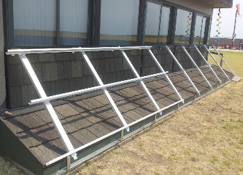
We elected against roof mounting, as we had ground space on the south side of our office. Roof mounting is common, but makes periodic roof repair and replacement more expensive. We can brush snow off ours, and even clean them when they get dusty. We fabricated the mounting brackets from aluminum stock, to eliminate maintenance.
The solar panels are quite sturdy, and hail is normally not a problem. Indeed, if hail damages the panels, we expect that our roof will be severely damaged as well.
Monitoring the Output
We used a TED System to monitor the output and the office usage. The TED system uses two current sensors--called MTUs--which are placed inside our breaker box. One MTU monitors total energy used, and the other is limited to the output of the solar array. This data is carried via the office power lines to a monitor which is connected to the internet router, and then accessed via a web browser.
The system gives real time output, graphs historical data, and also exports data in the CSV format, so you can do detailed spreadsheet analysis of system.
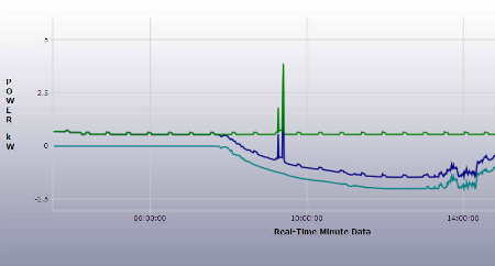
Here is a graph of the minute by minute output in kilowatts. On the left side of the graph you can see the green line, which shows the power being used by the office. The small squiggles in the line are result of a device--a furnace or refrigerator--which is cycling on and off.
The light blue line at the bottom is the output of the solar panels: it is zero for a period of time, then slowly increases as the sun comes up. Since solar power is charted as a negative value, increasing power means that the line moves downward as more power is generated.
The dark blue line represents the net energy, so when the dark blue line is below the zero point, it means that we generating more solar power than our total usage, and therefore exporting power back into the grid. The large spike in the center of the graph was merely a demonstration: we turned on the air conditioning for a couple of minutes, so you can see the large surge in energy usage, and that suddenly we are using grid power, not exporting to it.
At the far right side of the graph, you can see the solar power output becoming erratic. This was because, after a clear morning and smoothly increasing solar output, some high clouds formed and diminished the output of the solar panels. As the clouds move, the output varies, creating the wiggly lines representing reduced output.
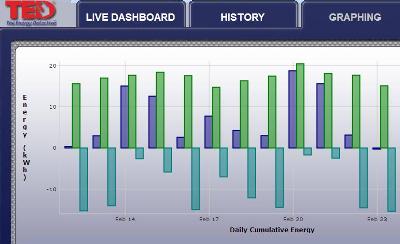
In the graph to the right, you can see the daily output, charted in a bar graph for 12 days. The light blues lines which extend downward represent the total solar output for the day: the longer the line, the sunnier the day, and the greater the total output. The green lines which extend upward represent the total power used, and the dark blue lines indicate the net power: the difference between the solar output and the total power used.
On the far right side of the graph, on February 23rd, we had reduced energy usage and good sun. If you look carefully, you can see that the dark blue bar is slightly below the zero line, which mean that for that 24 hour period, our total solar output was slightly greater than the energy used. In other words, the panels created more power than we used that day.
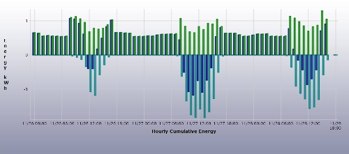
Here is a final graph: this is a bar graph showing three days of hourly data. On the first day, the solar output was reduced due to cloudiness but on the second and third days, the solar power was stronger, resulting in 5-7 hours of net solar generation back into the grid. This is shown by the dark blue lines which are below zero.
Who Should Buy Solar?
We like the solar array. It is nearly zero maintenance, makes no noise, and produces significant power nearly every day--so our electric bills are significantly lower. But the economic analysis of solar varies with every user and locale. Most installations qualify for a 30 percent federal tax credit, and state incentives vary widely. Like most forms of power in the US, solar is subsidized.
Solar panels lose a little efficiency over the years, so that 30 year old panels have about 85-90% of the output of new ones. Another big variable is electric rates: base rates can vary widely, and some consumers pay an increased rate for peak power. Future electrical rates matter, too.
Carbon emissions are reduced, but it reportedly takes 3 to 5 years to generate enough power to offset the carbon used in production and deployment of the panels, so the carbon effect is a delayed one.